


Vol.21 Color Universal Design
| Have you ever heard of the term “Color Universal Design”? Abbreviated as CUD, this concept involves creating products, facilities, buildings, environments, services, and information with color schemes that are accessible to as many people as possible. It takes into account the diversity of human color vision. |
Information using color
Color has the power to move the viewer’s mind, and at the same time, it has the power to convey information more clearly and effectively by organizing and emphasizing information. Today, almost everything in our society is colored, including public information displays, industrial products, information equipment, printed matter, news reports, and textbooks. However, because of individual differences in color vision, some people have difficulty distinguishing certain color combinations and may experience inconvenience in some cases.
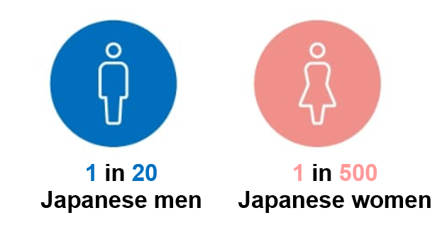
About one in 20 men is “colorblind.”
| It is said that about , or about 3.2 million people nationwide, are classified as congenitally colorblind by color-vision tests. This is a genetic trait and, like blood type, is an individuality.
Among those with common color vision, some see colors differently from others because of illnesses such as cataracts, glaucoma, and low vision. Designs that consider color-vision diversity are required by society. |
 |
Actual Vision
Color vision differs depending on the type of color blindness (P-type or D-type). The following is a simulation of how P- and D-type colorblind people see the vision of normal colorblind people:
How do people with normal color vision perceive colors, how do people with P-type color vision perceive colors, and how do people with D-type color vision perceive colors?
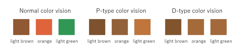
*These simulation images are reproduced as an example and do not perfectly reproduce the colors perceived by people with color weakness.
Key Points of Color Universal Design
The NPO Color Universal Design Organization lists the following three key points in universal color design.
(1) Select a color scheme that is easy to distinguish for as many people as possible.
Saturation (color vividness) is more easily distinguished by combining “high” and “low” colors, whereas lightness (color brightness) is distinguished by combining “light” and “dark” colors.
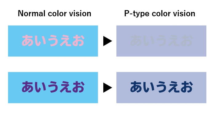
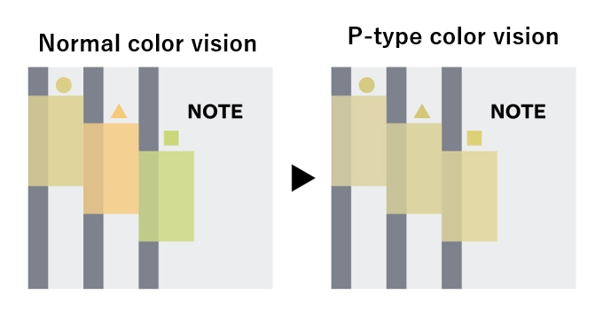
(2) Ensure that information is conveyed to those who have difficulty distinguishing colors.
Changing shapes or using marks together can make it easier to convey information to those who have difficulty distinguishing between colors. It is important to make shapes and marks as large as possible so that people can easily distinguish different colors.
(3) Enables communication using color names.
Items that may be exchanged using color names should be listed to facilitate communication.
References
Color Universal Design Recommended Color Scheme Set Guidebook, Second Edition, produced and published by Color Universal Design Recommended Color Scheme Set Production Committee
Delivering Information Friendly to All People A Guidebook for Universal Design of Visual Information,” published by the Disability Welfare Division, Department of Health and Welfare, Aichi Prefecture
Back to List